Photography
Our photography transforms our strategy into visual language through a warm, inviting style infused with glowing natural light and joyful, open people.
In this section...
Overview
We should maintain stylistic consistency in the look and feel of our photos. In this section, we will cover the four main subjects of our photography system and how to best create this consistency. Through our photography, our brand personality comes to life.
Inquisitive
We can uphold this personality word through showing our students actively engaged in what they are doing or who they are with.
Affirming
How can we capture the diversity of people, life, and studies at the college? By making sure we capture the range of clubs and societies at the school as well as the different students, staff, or faculty that make up our college.
Ambitious
While ambition shows up all across campus, a great way to highlight ambition is in academic studies as well as the many athletic programs students participate in.
Ethical
Bryn Mawr cares deeply about not only its people, but social issues and the world outside the college. Highlighting the way those at the college lead or serve in the social sphere, both on or off campus, is a great way to highlight this personality word.
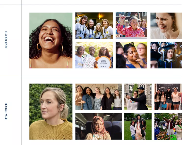
Portraits
Portraits are the most intimate of our styles of photography capturing the most important part of the Bryn Mawr story: the people. Portrait photographers can pose subjects gazing at the camera or appear more candid and “of-the-moment.” Images should highlight who the subject/s are and their unique personalities.
What makes our photography of people distinctly Bryn Mawr?
- Intimate portraits with interesting and unexpected cropping and angles
- Even our posed portraits prioritize authentic moments and personality over technical perfection
- A warm glow reminiscent of our lantern’s glow captured via golden hour, natural light, or created in post-processing
- Shallow depth of field
- Hints of the subject’s natural surroundings
- Brand colors showcased in the subject’s attire and surroundings when possible
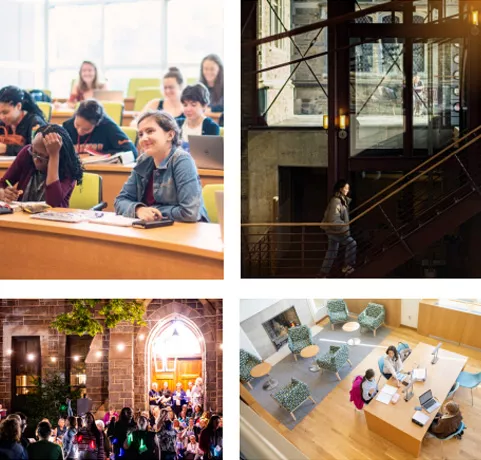
Active People
As the Scholarly Sister, Bryn Mawr is known for having students that stay busy and active. Highlighting this part of our culture through photography helps us capture the essence of our community. Like our portraits, we want to capture genuine moments of our people in the classroom, on the field, at a club, a reunion, Lantern Night, or anywhere else the activity is happening.
What makes our photography distinctly Bryn Mawr?
- Crop just close enough to show the context of what someone is doing, but such that the photo still feels specific and the eye is drawn to one moment
- Avoid wide crops of large areas or activities (most of the time)
- Immerse yourself in the scene, but be a fly on the wall. Minimize your presence.
- Don’t interrupt the moment, instead observing and capturing natural moments and interactions.
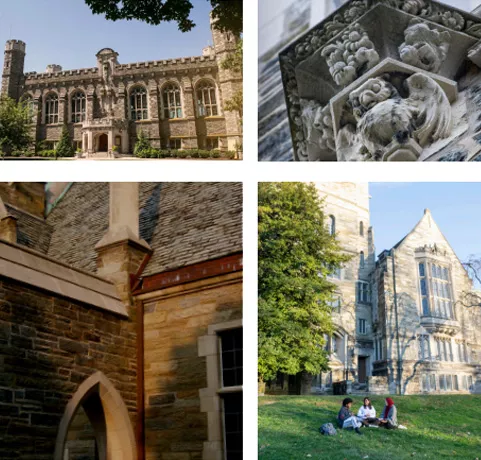
Campus Beauty
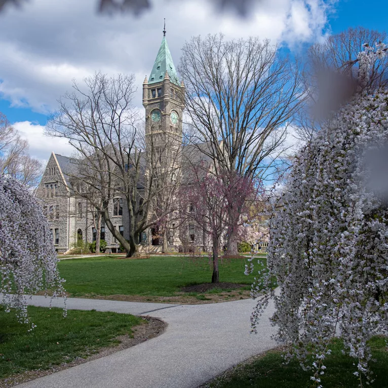
Our campus is known for its beauty and the many buildings that exemplify the Collegiate Gothic Style. Ginko and Cherry trees are scattered around the campus. Wisteria winds its way up pergolas and ferns grow along stone walls. By capturing interior and exterior shots, with or without people, we can share what it feels like to be on our campus.
What makes our photography distinctly Bryn Mawr?
- Wide angles that showcase our distinct campus architecture and beauty
- Campus photography that shows details that tie to our deliberate visual identity elements — frames and patterns
- Capturing students interacting in and interacting with our campus spaces to showcase academic prowess and action
- Plan shots ahead, wait for good weather, then try shooting during Sunrise, golden hour, and blue hour (just after sunset)
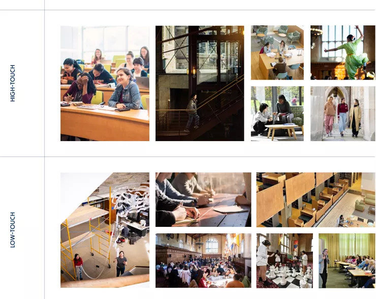
Active Spaces
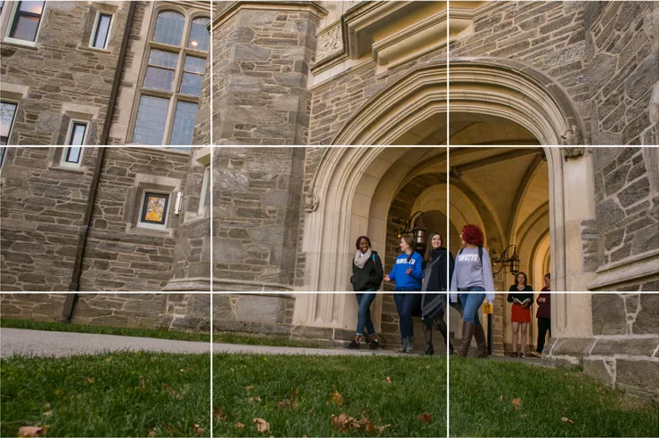
Our active space style of photography is for when we want to showcase less of the aesthetics of a space and more so emphasize the people interacting in or with the space. Like our Active People photography, these images are similarly candid, use natural light, and may be composed around a space that people happen to be moving through or using. These may incorporate larger groups of people than the other page covers as well.
What makes our photography distinctly Bryn Mawr?
- Wide angles that showcase our distinct campus architecture and beauty
- Campus photography that shows details that tie to our deliberate visual identity elements — frames and patterns
- Capturing students interacting in and interacting with our campus spaces to showcase academic prowess and action
Lighting, Saturation, Contrast, & Brightness
Our photography is a large part of our visual language; as such, we should keep certain points in mind when capturing images for the brand:
- Using a gold toned reflector to create washes of warm light across subjects.
- Utilizing diffusers over light sources so shadows are softened and minimized. Diffusion filters on a camera lens can also be used to create this glow effect (called halation) from a light source.
- Planning shoots on days, or at times of the day like golden hour, where the light will be intense and warm.
- Shoot with a depth of field shallow enough to soften and blur foreground and background elements and soften the look of the photo, while maintaining focus over the subject.
Preferred Examples
warm lighting over
subject. Successful
shallow depth of field
and use of glow effect.
warm lighting over
well-positioned
subject. Warm,
directional light.
lighting throughout
space.
hour light. Placement
of subjects in natural
light is excellent.
Less-Preferred Examples
treatment. Lack of
shallow depth of field.
Extreme angle is odd.
contrast. Difficult to
see individuals’ faces.
out and high-contrast
light in background
disctracts.
distracting background
and saturation has
been increased too
much.
Cropping
The "rule of thirds" is one of the most fundamental elements of photography to keep in mind when composing or cropping a photo.
The basic principle is to imagine the photo broken into thirds, both horizontally or vertically. Placing points of interest along the lines or at their intersections will help a photo become more balanced. A photo with a challenging composition can be made more compelling when cropped with the “Rule of Thirds” in mind. This can be a helpful guideline and tool that we should use regularly, but it can also be intentionally broken if the situation calls for it (such as portrait photography where the subject might be framed in the center of the composition.
Low-Touch Editing
Our professional photographer will handle most high-touch editing that needs to happen, but what about low-touch images such as social media content?
We still want these images to remain as aligned with our brand look and feel as possible. When shooting phone photography, much of the content on the previous pages still applies, but here we are giving some Do’s and Don’ts for editing this kind of low-touch photography.
DO
- Err on the side of subtlety. Over-editing is more distracting than an under-edited image.
- Treat each image differently. Due to lighting conditions, each image will need its own adjustments or levels of adjustment. Try to compare images against the look and feel of the high-touch images in this deck and try to get as close as you can to the same feeling.
DON’T
- Use preset filters at high numbers. These will often create a distracting look and make images look dated due to filter strength. Rather we may choose to use a filter and reduce its strength, such as Instagram’s ‘Gingham’ at 25% instead of 100% which diffuses some of the light and adds a subtle warming effect
No Editing
This image was taken using portrait mode and is not edited. It doesn’t necessarily look bad, but the colors aren’t quite as warm as we would like them to be to align with our other brand photography and there is an overall flatness in tone.
Preferred Editing
Contrast: +8
Warmth: +40
Highlights: -8
Here we used the Instagram app to edit this image just slightly. We added more contrast so the subject’s features were emphasized more. We also increased the warmth significantly. This helped with some of the flatness we were getting in the original image. Finally we brought the highlights down just slightly to make sure our subject had dimension to the curves of their face.
Over-Editing
Contrast: +28
Warmth: +70
Highlights: -8
Saturation: +30
Brightnesss: +40
This image is an example of the over-editing we want to avoid. We increased the contrast to a distracting amount as well as causing the image to become to yellow due to too much warmth. The added saturation is also distracting and the level of brightness is unnecessary and washes the subject out.
Contact Us
Communications Office
Bryn Mawr College
101 N. Merion Ave.
Bryn Mawr, PA 19010-2899
Phone: 610-526-6520
Fax: 610-526-6525
Package Delivery
Dolwen House
221 N. Roberts Road
Bryn Mawr, PA

